|
Getting your Trinity Audio player ready...
|
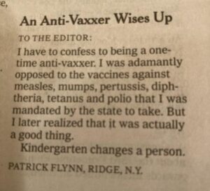
OWN VOICE. ~ InPerspective by Gregg Dieguez —
You’re probably as tired of reading about COVID-19 as I am writing about it, so let’s just do pictures, shall we? The conclusions are pretty darn obvious, but you might be surprised at what comes next… [Click to Jump to the Conclusion]
Footnotes: There are no Footnotes this week; this is drop dead simple stuff.
Images: Click to enlarge for improved readability in a new window.
And how’s the (former) world leader in medical research and pandemic response preparedness doing? Just absolutely abysmally, thanks for asking…
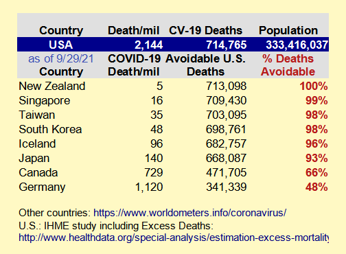
Deaths per capita: U.S. 2nd worst among countries > 10m population (Czechia)
Cases per capita: U.S. 8th worst among countries > 10m population
https://www.worldometers.info/coronavirus/
Depending upon which country you compare the U.S. to, we could have avoided anywhere from half to almost all COVID-19 deaths. Keep in mind these countries were in control of this Pandemic BEFORE VACCINES. Basic Public Health measures, some of which we have still not adopted here – like mass testing, contact tracing and quarantine – kept countries in the direct path of the infection from China, like Taiwan and South Korea, from being overwhelmed. Even Japan, with its strangely delayed vaccination program, has only 7% of the U.S. COVID fatalities.
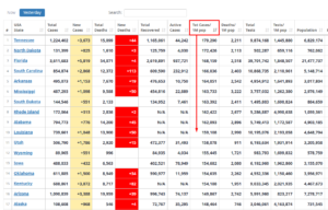
And what states are leading the Race To The Death?
New leader in Deaths/M: Mississippi (Calif. 33rd)
New leader in Cases/M: Tennessee (Calif. 38th)
https://www.worldometers.info/coronavirus/country/us/
Of course the state outbreaks have varied over time. This grey graph below shows selected states where both California and Michigan have suffered outbreaks. Of course the introduction of two things by June, 2021 was a game changer: widely available vaccines, and the Delta Variant. For a while, the vaccines were winning. But then Delta took off among the UN-vaccinated and now the clear new leader in this group is Florida, with Texas coming up on the outside….
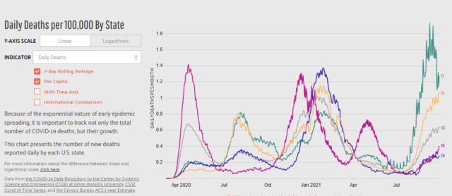
Speaking of races, there is a suite of animated “horse race” charts here [https://dangoodspeed.com/covid/total-deaths-since-july] that show how states moved up or back in the pack. I’ve included two examples below. The chart on the left shows reported COVID deaths per capita since July 1, 2020, also known as “you should have known better by now” because of the very visible suffering in NY/NJ in early 2020 which demonstrated that SARS-COV-2 was a virus to be taken SERIOUSLY. The chart on the lower right shows per capita deaths since people should have been vaccinated (June, ’21). Call that the “no excuses” chart.
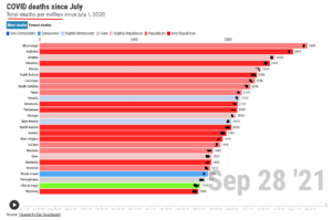
You might notice the effect of Republican leadership…
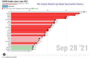
Speaking of Leadership, notice how Florida is doing in the chart at right? They have a lot of seniors, most of whom got vaccinated. So their vaccination rate is about average. But in spite of that, they lead the nation in per capita COVID deaths since mid-year. Why? they have a Governor who will spend lives to garner political favors, and that “Trumps” everything. Kind of un-masks the truth about COVID, eh?
So, Now What?
The leading professional group that forecasts COVID is the Institute for Health Metrics and Evaluation (IHME). Since I’ve been following them, they’ve been Dead Wrong In Public*, massively under-projecting cases and deaths. Beginning May, 2021 they woke up and made two additions to their projection charts. First, they now forecast 3 Scenarios in their series of charts. They retain their base projection, which I continue to suspect is under-estimated. They added an optimistic scenario: “Masked”, which is 95% universal adoption of masking. Of course, they haven’t talked to Republican Governors, so that’s not in the cards. And they added a “Worse” scenario (hover your mouse over the red button to read the full definition). Secondly, they acknowledged that we have had a huge number of deaths – well above insurance company actuarial norms – that have not been reported as COVID. Part of this is some states trying to hide or misclassify COVID deaths (NY, FL, AL come to mind), and part of the excess is people dying because they couldn’t get routine health care due to the system being clogged with COVID patients. There are plenty of heart-breaking stories about the latter.
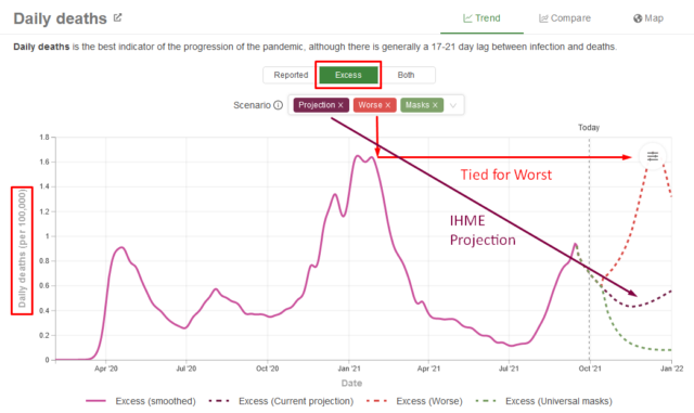
The IHME now projects 1,223,338 excess COVID-19 deaths by January 1, 2022, and that’s not the “Worse” scenario. Contrast that with “only” 714,765 officially reported COVID deaths as of 9/29/21. I submit that Excess Deaths is the correct measure of the damage from this mismanaged Pandemic. In other words, with schools reopening, holiday travel and germ exchange restarting with Labor Day, and people all over getting overconfident about their vaccines (or prior COVID survival), mass attendance at sporting events, and letting down their masking guards – we’re going to see another peak in the death rate which will approach the worst it’s been in the U.S. I know you didn’t want to hear that, and I want Thanksgiving and Christmas again, too.
Thanks for watching, I really had to get that all out of my system.
* borrowing a Dan Jenkins phrase.
** Sorry, but the lined circle is from the interactive chart controls and I can’t move that circle, but it’s translucent if you go to the website yourself.
More From Gregg Dieguez ~ InPerspective
Mr. Dieguez is a native San Franciscan, longtime San Mateo County resident, and semi-retired entrepreneur who causes occasional controversy on the Coastside. He is a member of the MCC, but his opinions here are his own, and not those of the Council. In 2003 he co-founded MIT’s Clean Tech Program here in NorCal, which became MIT’s largest alumni speaker program. He lives in Montara. He loves a productive dialog in search of shared understanding.


80,000 health care workers in NYC who have been on the front line of covid for the last 18 months refuse the experimental gene therapy (vaccine) and will be losing their jobs rather than be injected with what they’ve actually witnessed, the massive side effects and deaths. I wonder what they know that Gregg doesn’t, hmmmm obviously Gregg is so caught up in the politics that he doesn’t really care about the truth, just strutting his arrogance weekly, for all to see.
Got a source for that? There are health care workers who have refused, but nothing like what you’re claiming.